
In my initial proposal for this project, I focused on the overall visitor experience to the College's Lakeside vestibule, noting that there was a huge opportunity to create a much smoother, more welcoming experience for visitors. While visitors were my primary target audience, it was rightly pointed out that staff are equally affected by the visitor experience. Because staff are required to give directions to a visitor, receive communication that the visitor has arrived, and then go open the door for the visitor to let them in, it’s clear that the vestibule experience affects both visitors and those they are visiting.
In my proposal I explained how I started out thinking about creating an interactive public art project in the vestibule area around the idea and practice of gratitude. My intent was to counteract this sterile, cold, unwelcoming environment that does the opposite of fostering community by creating something beautiful, positive, and uplifting that brought people together. The more I thought about it though, it seemed superfluous to do this before peoples’ basic needs were met in the space. How could I expect someone to reflect on, express, give or receive gratitude in a creative form when the construct of the space is one of frustration, deficit, and unfriendliness?
Note that what follows are assumptions based on personal experience. These assumptions will be challenged through a research and data gathering phase. The assumption is that the Lakeside Vestibule lacks a warm, welcoming environment and does not outline clear steps a visitor should take to gain entry into the building. Visitors are often frustrated when they cannot get into the building, reach their contact, and are left feeling awkwardly unwelcome. In turn, staff have an added layer of logistics to muddle through, with no clearly established process for receiving visitors. Staff are often wasting valuable time waiting in the cantina for visitors to arrive or are chained to their desks in case a visitor does arrive and tries to call them.
With a scope of this one semester in mind, I proposed a new entry experience to include redesigned placement of physical objects in the space and signage/directory in the form of a touch screen panel or kiosk.
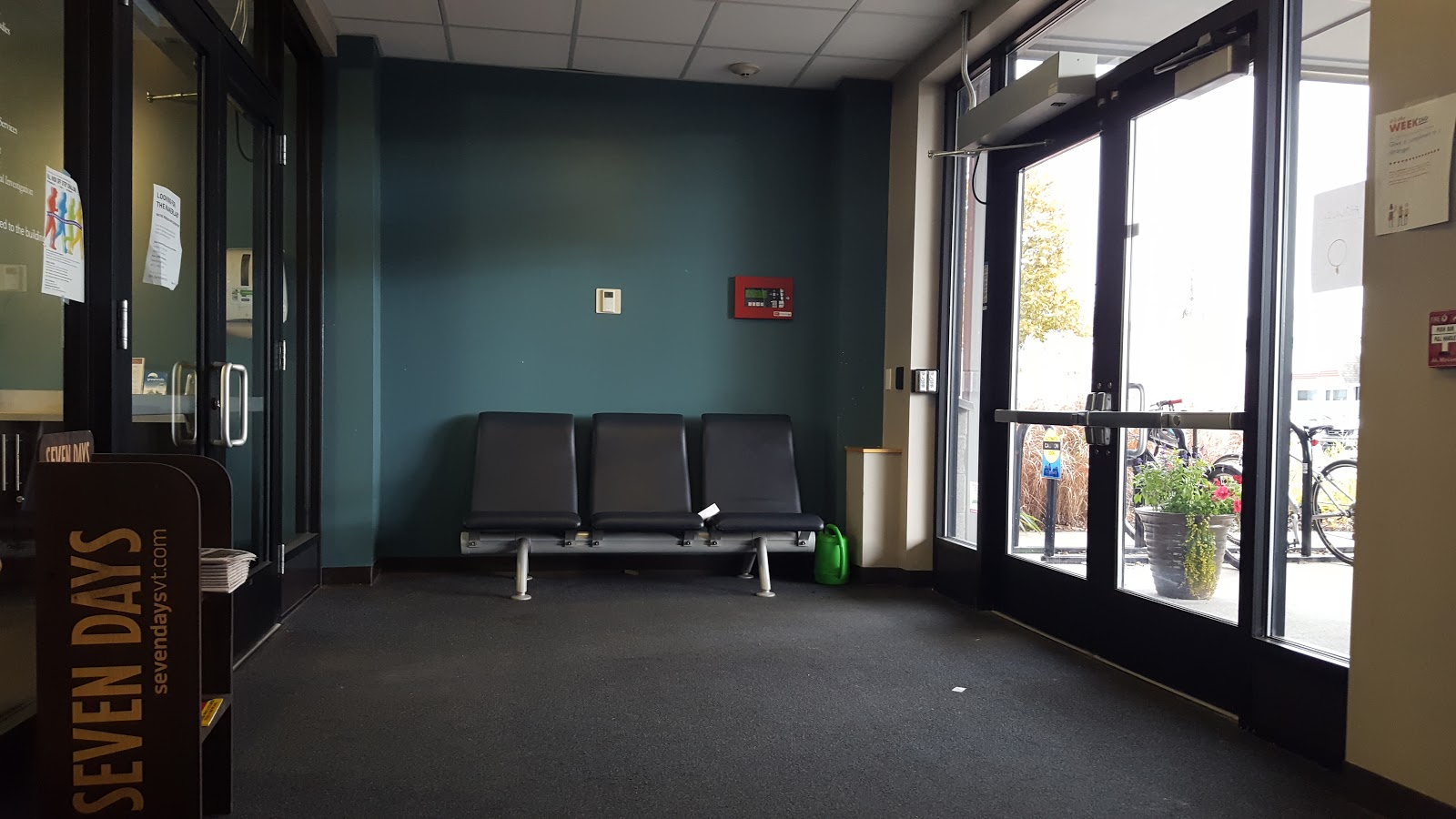
Photos of the existing vestibule


Process
1. Proposal
2. Research: direct user observation, interviews, and a focus group, plus exploring existing external solutions to a digital directory kiosk. I conducted 2 observation sessions, in-person interviews (visitor and staff), a focus group, and written interviews.
3. Distillation of data to find major pain points, including SWOT analysis
4. Listing of features, mapping to user experience and usability goals
5. Ideation/Prototyping: The following steps took place to arrive at the final prototype.
* Paper prototype
* Testing (with prospective visitors, current staff, and the class) > Iteration
* Wireframe clickable prototype 1.0
* Testing (with prospective visitors, current staff, and the class) > Iteration
* Wireframe clickable prototype 1.1
Goals for the Design
The following User Experience and Usability Goals were defined at the onset of the proposal. They remained the goals for the length of the project, considering what was learned during the research phase.
Testing shows that the following set user experience goals are met:
* Helpful/supportive
* Emotionally fulfilling (in the form of welcoming and friendly)
* Uncomplicated/easy/satisfying
Testing shows that the following set usability goals are met:
* Effectiveness
* Efficiency/utility
* Learnability
* Safety
 |
| Same page, mocked up in Wireframe Pro. |
 |
| Paper prototype page |
Design Choices / Features
The final artifact produced for this semester through the design process was a clickable/interactive wireframe built in Wireframe Pro Mockflow software. This is a mockup for an app that would exist on a touchscreen monitor or tablet. This screen would be located within a nicely designed kiosk space immediately upon entering the Lakeside vestibule, which would require the rearrangement of existing furniture. All buttons are clickable, except for the keyboard. A small database is mimicked, as is the functionality to actually make a call or send a text message through the system. Twelve screens are mocked up in the wireframe.
The most important design choices that I made are 1) a streamlined, limited-choice, easy to navigate and welcoming interface and 2) to allow integrated voice calling and text messaging/chat within the app. Both of these major goals address priorities of the three most important user experience goals: Helpful/supportive, Emotionally fulfilling (in the form of welcoming and friendly), and Uncomplicated/easy/satisfying. Incorporating familiar design elements and mobile functionalities (ie: message button, hide/show keyboard, etc) add to the ease at which a new user can learn and navigate the system. A major improvement that this app offers over the traditional paper directory is the ease at which the directory can be updated every time there is a change to the personnel within the building (which is frequent).
I hope to pass this research and these suggested improvements along to the proper department in the college for consideration.
MFA in Emergent Media | Fall 2018 semester | Human Interfaces, Prof. Al Larsen
Assignment: Choose a project that could benefit from a redesigned user experience. Conduct research, create paper and lo-fi prototypes, test, and create an interactive prototype that could address user needs.
A few sample screens from the wireframe are below:


0 comments:
Post a Comment